
The Timeless Package
An exploration in graphics for the connoisseurs of paper and pleasure

This package packs a lot of punch. It’s an elegant print collection of shareable treasures—serious and silly in the same breath—my first excursion in graphics.
I’m proud to share it because, as many of you know, I’ve been drawing on and off my whole life…but never with the ambition and intention that went into this project.
The result is a small universe of experiences in print, presented in two components:
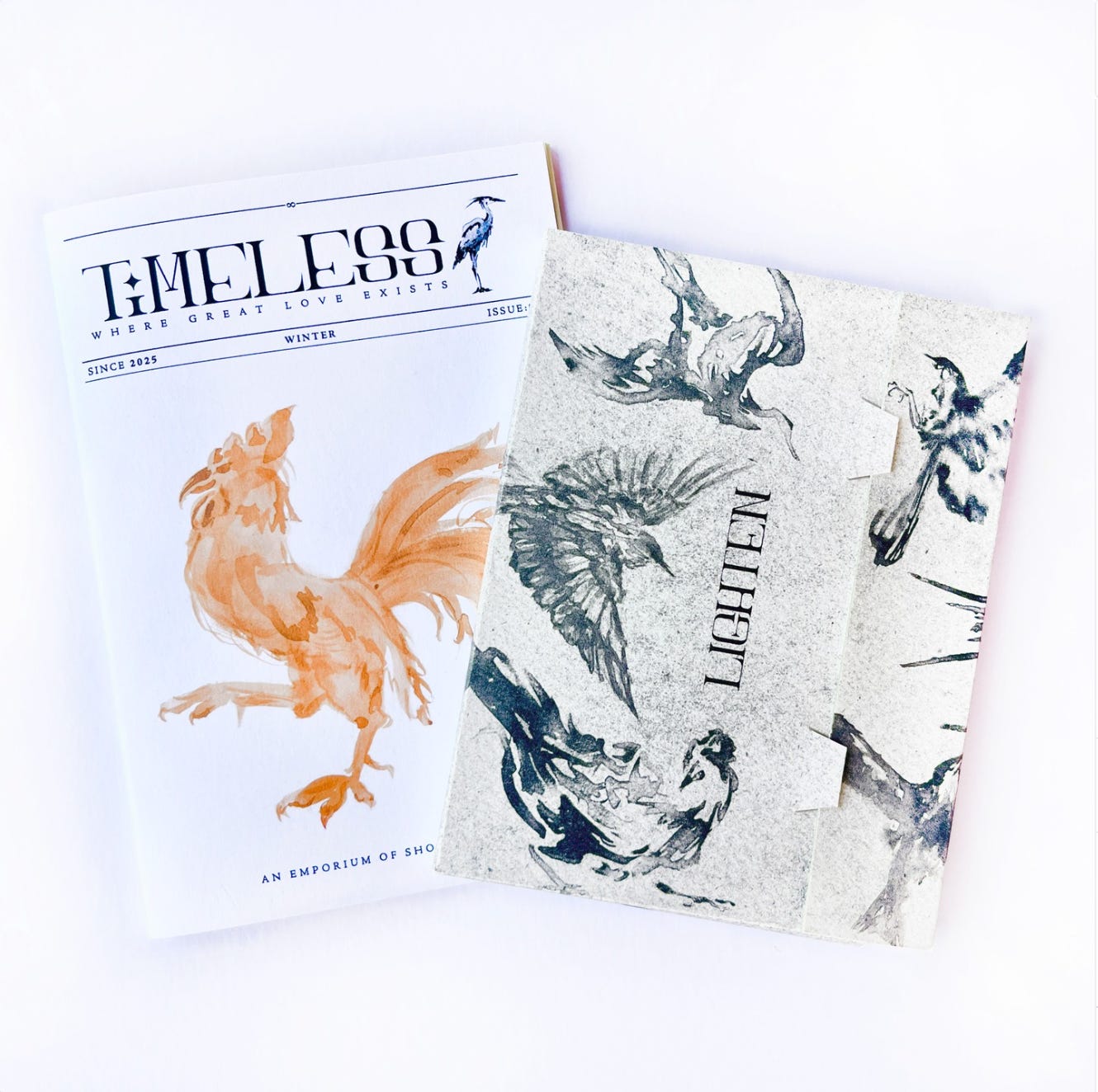
The pilot run of my new magazine, Timeless
A gorgeous folder containing four postcards, two greeting cards, envelopes, stickers…all decked with birds
The medium, paper and ink, is a nod to the bygone era of funny papers and my grandma’s hand-written notes. Printed, mailable things. Experiences that take time to unfold. A reprieve from technology.
I understand that for some people, social media conditioning makes interacting with my work feel more like a chore than anything. Reading a poem in print—to say nothing of mailing a postcard—takes real intention and time. But I know every person subscribed to this list, and you are the kind of people who still get your kicks from good conversation, slow meals, handmade objects, and so forth. You are not totally beholden to common social engineering.
You have carved out some parts of your life as sacred, and those are the pockets I intend for this magic package to land.
Both pieces are “prototypes” I developed in a three-month whirlwind last winter with tremendous support from my partner. I intend to use them as models for future projects, so all profits from these works will move us closer to Issue 1 of Timeless Magazine and more collections of postcards and greeting cards.
A few notes on the products:
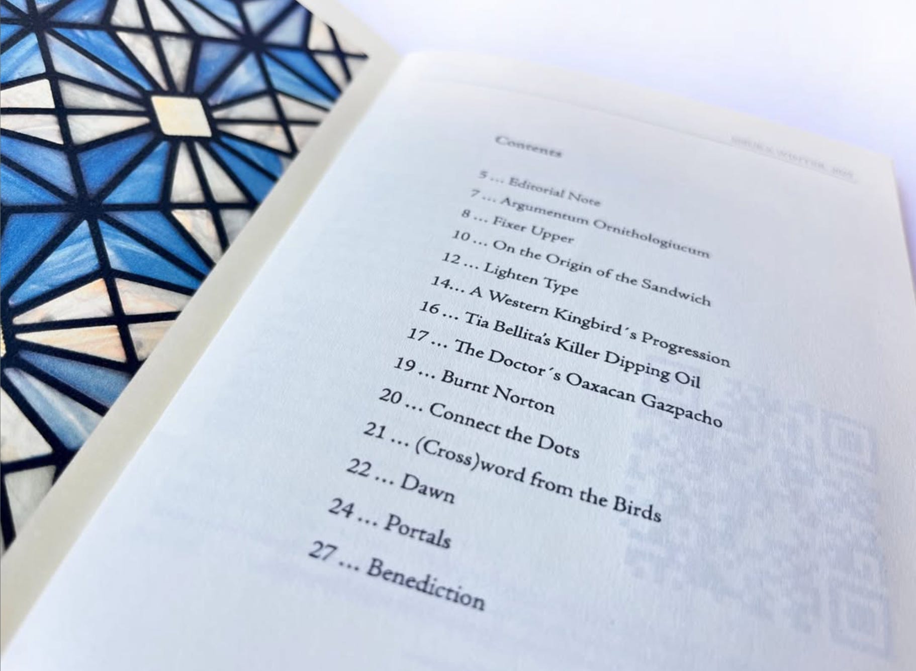
1. Timeless Magazine
Issue 0: An Emporium of Short Stories is, in large part, a collection of my silly glass-artist fancies put in writing, paired with illustrations, and brought to life with the creative direction of my partner, Rene. (It also features a linocut and essay by my brother-in-law). It’s free to read digitally, but is more delicious in print. There are 125 copies, all printed and assembled by yours truly.
You’ll find lots of little delights in its pages, including recipes, games, poetry, commentary, and original graphics. And while I developed most of the content for this pilot run, Rene and I will be expanding the scope of the publication and its topics in future issues. Timeless Magazine will serve as an alternative medium to facilitate culture, collaboration, and creativity.
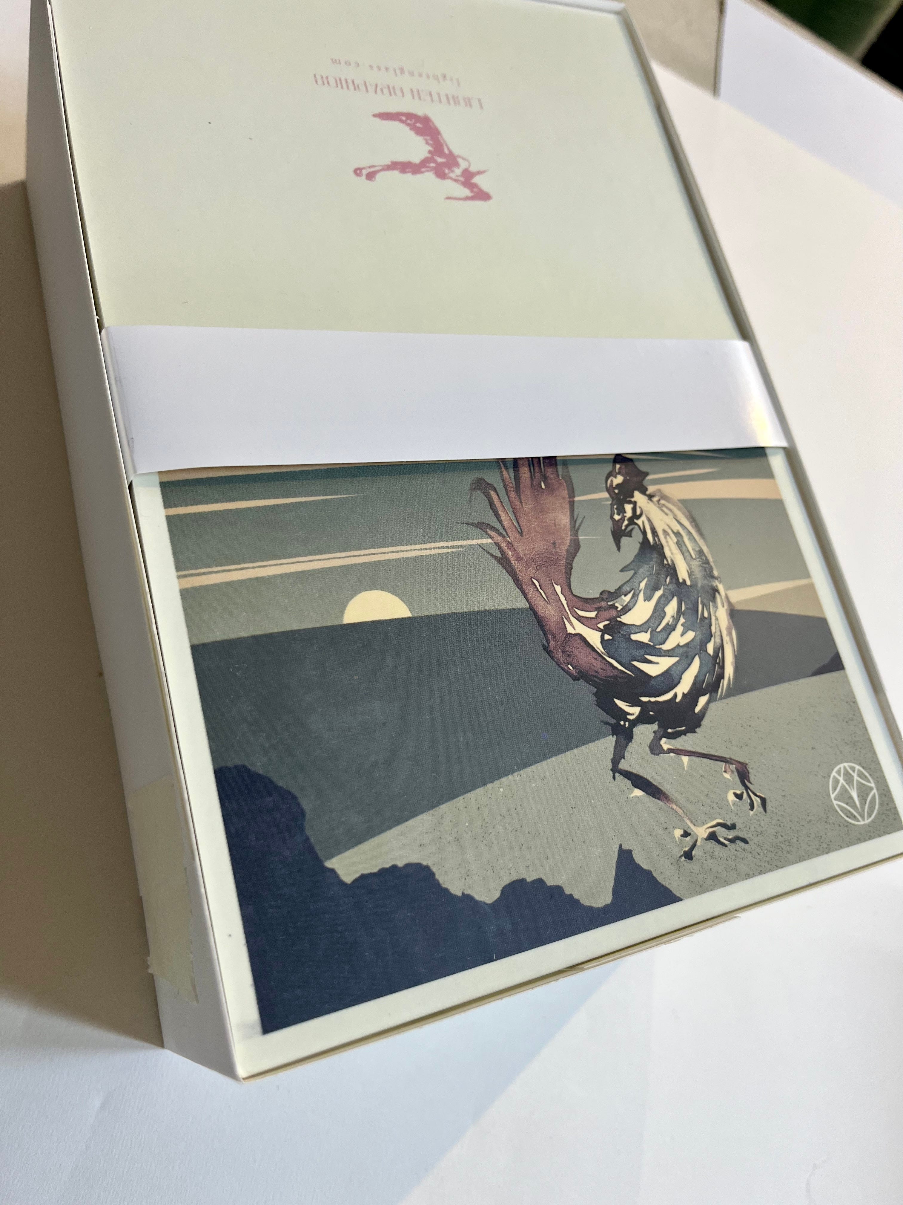
2. The Folder
The paper is good stuff. It’s rich, heavyweight, acid-free paper, soft on the eyes and easy in the hands, decorated with an elegant collage of little birds in muted grays.
Inside, you’ll find two pockets, one with postcards, the other with greeting cards, envelopes, and stickers. The postcards and greeting cards are the crown jewel, to me—functional artworks produced on a vintage Heidelberg offset machine with a family-owned print shop in Oaxaca. They feel like velvet but are durable enough to travel internationally. I sent one to Bruges this month. The envelopes are also custom artworks designed with a tasteful iteration of the new Lighten logo.
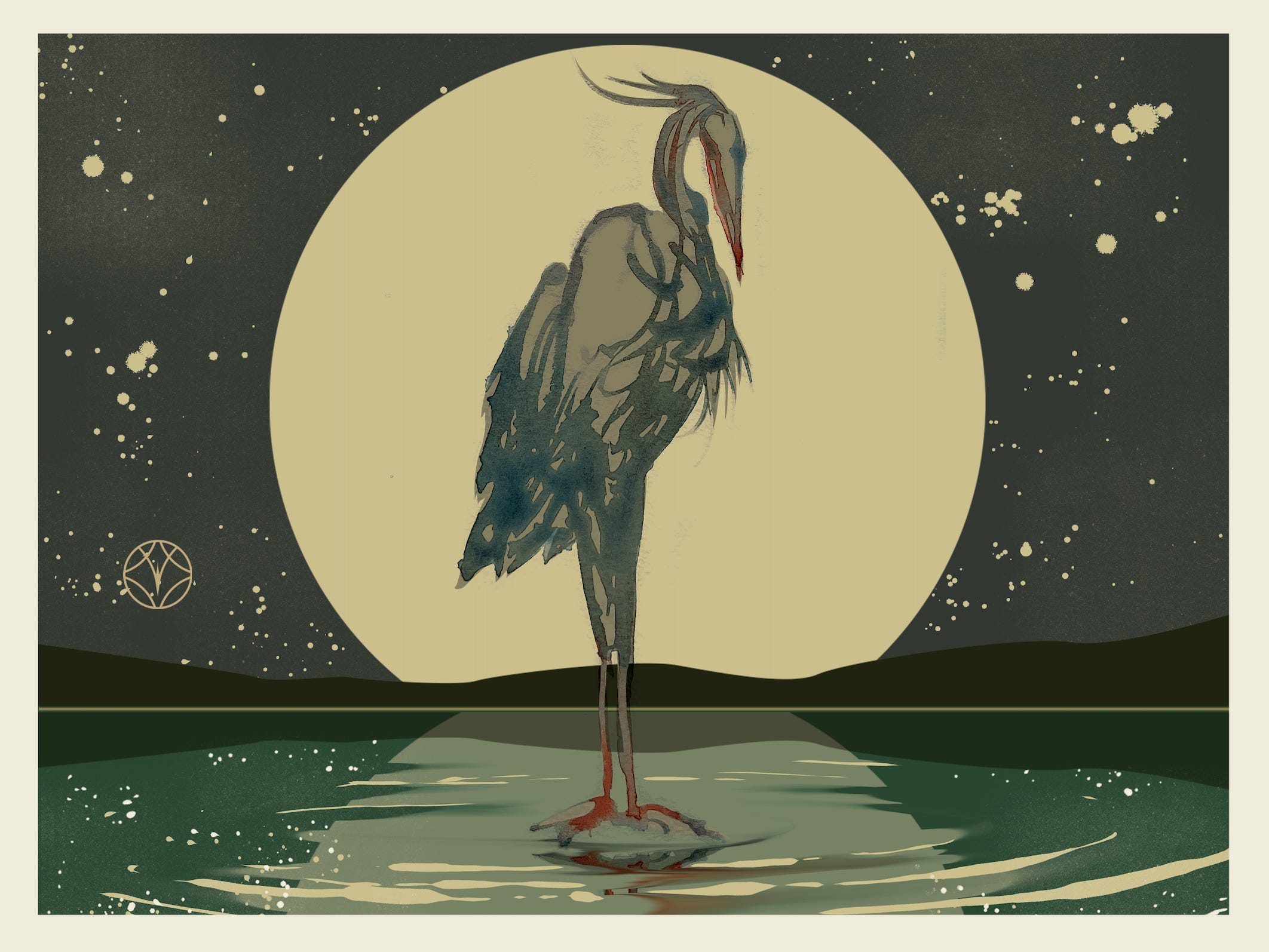
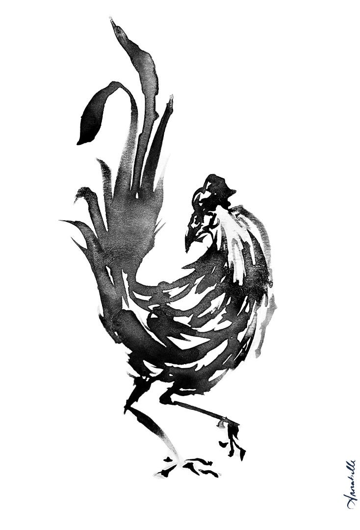
The Birds
Symbolically, the birds represent messengers.
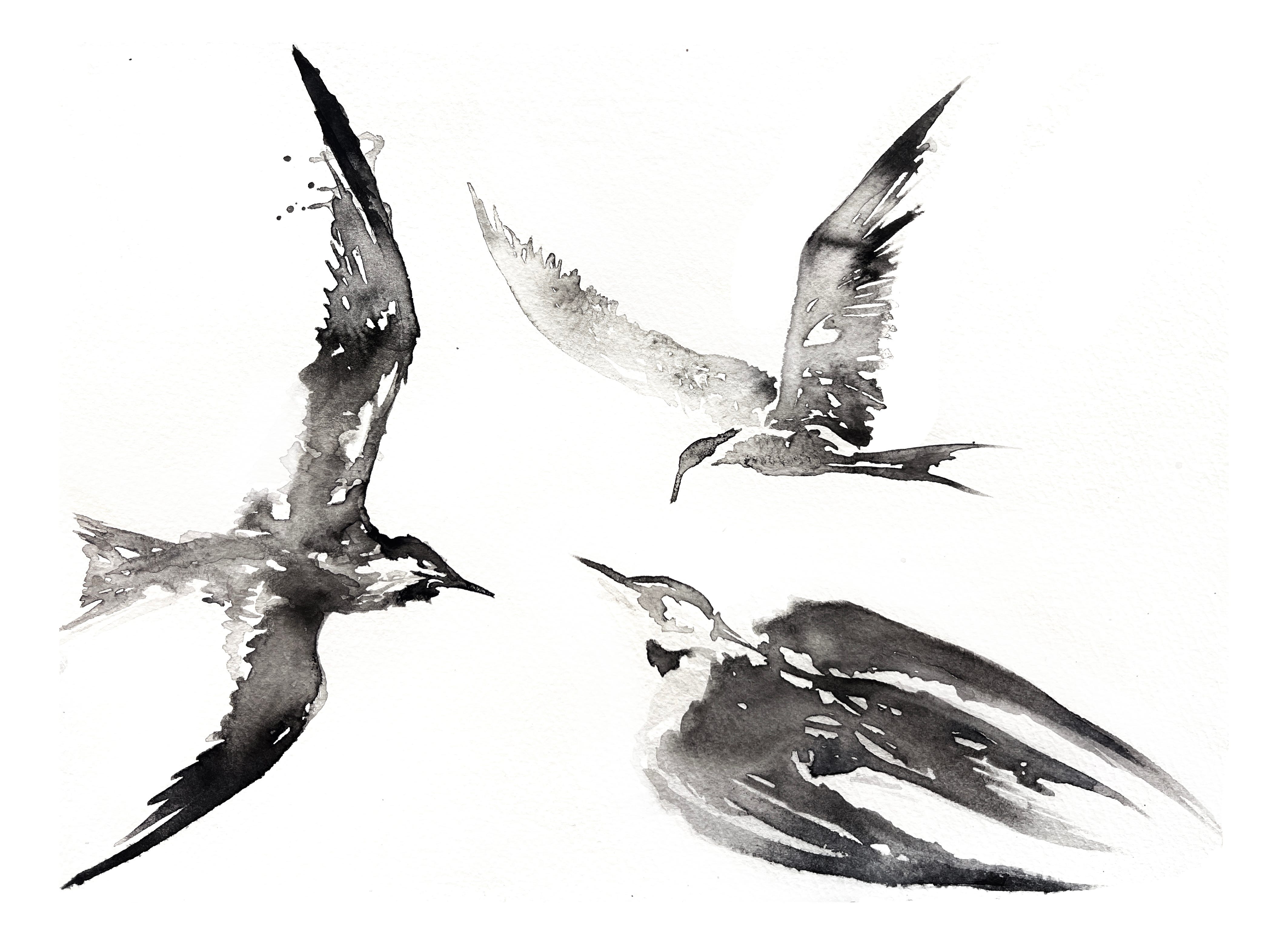
Practically, they are evidence of my hand learning to move ink on paper with genuine intention for the first time in my life.
Functionally, they are images that underwent many evolutions to arrive before your eyes, either digitally or in print. There are many layers here.
I am a glass glazier by training, with no formal art background. I only began drawing more regularly about two years ago, and even then, with no instruction or method. So when I ended my stained glass apprenticeship and took my first independent commissions, I realized how underprepared I was for the design elements of the work.
In my second commission (currently in progress), the clients requested that their window feature herons and least terns, so I began sketching…and sketching…and sketching. I eventually picked up calligraphy ink and watercolors, honing in on the anatomy and essence of common bird forms. Well over a month went by. Well over a hundred drawings. A dissected bird. Wing structure. Feather patterns. Muscle tension. Eventually, a direction emerged. There was a life force within a few of the images that hadn’t existed before in my work, and it was asking to be rendered further. So a few of them, just six, Rene and I developed in graphic form for print.
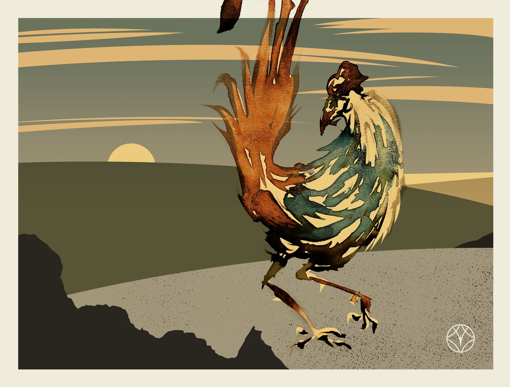
Graphic Iterations
This exploration showed me that every drawing has many potential lifespans.
In the case of the cards (see “Today” below), the central bird forms are all ink drawings rendered with Photoshop in a lovely graphic landscape backdrop. The backdrop shifts them from solitary figures into characters in a short story. The graphic is then returned to analog form, this time not a drawing but a card—a medium for connection over long distances. They become vehicles for love and imagination.
See “Today” below: a rooster in ink, rendered against a new graphic backdrop, then offset printed.
There are about 70 Timeless Packages left as I write this (with 25 extra magazines for sale individually). If you don’t have one yet, go check it out in the store or, if you know someone who might appreciate it, please share it.
Next up here on Substack:
“Quiet Business” is what I’m calling my business model in 2026
Reports on my first residential stained glass commission, from design to installation
Till next time,
Annabelle

I’m an independent artist here to write technical reports on my glass and graphics practice for anyone who wants to interact with high-quality art or have a look behind the scenes of how it’s made and delivered.